Organise the long page by when the product is used
Sections follow the user's day (before training, mid-session, after training), each with its own photo and instruction, instead of a feature list.
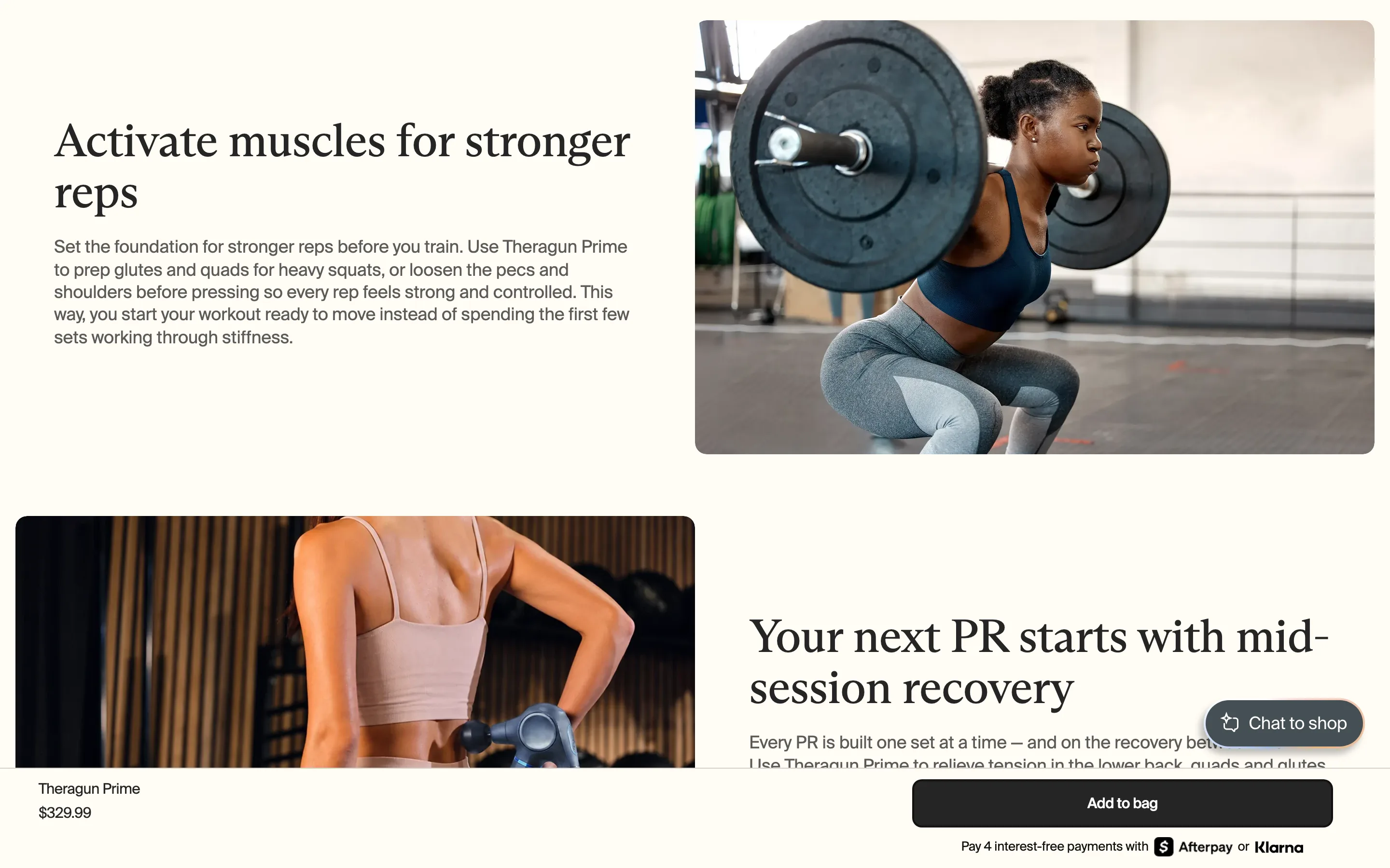
What it is
Below the feature cards the page is organised by use moment: "Activate muscles for stronger reps" (before training), "Your next PR starts with mid-session recovery" (during) and "Stay ahead of soreness after training" (after). Each block pairs a photo of that moment with a short instruction of what to do.
Why it works
Features describe the product; use moments describe the buyer's week. Structuring the page around when it gets used lets the shopper picture it in their own routine, and each block quietly teaches them how to get value from it, which protects retention as well as conversion.
How to test it
- Hypothesis
- Organising product page content by use moment instead of by feature will lift add-to-cart rate for a product used in a routine.
- Primary metric
- Add-to-cart rate (product page sessions)
- Guardrail metric
- Scroll depth to the buy box repeat or sticky bar
Related ideas
Want this tested on your store?
We run the experiment, call the result honestly, and get paid on what it adds.
See the performance program