Head each purchase tier with a full-width label strip
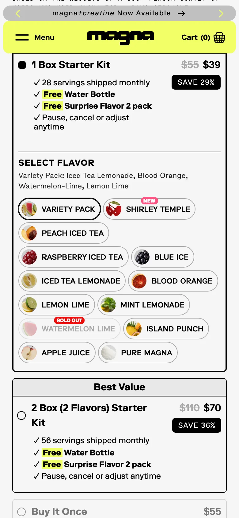
Each tier card opens with a strip naming who it is for (Most Popular, Best Value), lists inclusions as ticks, and dims the one-time purchase at the bottom.
What it is
The buy box is a vertical stack of tier cards. Each is headed by a full-width label strip (Most Popular, Best Value) and shows its price against a struck one with a save badge, then its inclusions as ticked lines: servings shipped monthly, a free water bottle, a free surprise flavour pack, pause, cancel or adjust anytime. The one-time purchase sits last and visually dimmed.
Why it works
The label strip answers "which one is for me?" before the shopper reads a number, and ticked inclusions make the difference between tiers countable rather than something to infer from prices. Dimming the one-time option does not hide it, it just tells the shopper which choices the brand stands behind.
How to test it
- Hypothesis
- Labelling each tier with a full-width strip and listing inclusions as ticks will lift subscription take rate and average order value versus an unlabelled price list.
- Primary metric
- Subscription share of orders
- Guardrail metric
- Product page conversion rate, to confirm the stack does not slow the decision
Related ideas
Want this tested on your store?
We run the experiment, call the result honestly, and get paid on what it adds.
See the performance program