Show the routine as a timeline with the frequency in caps
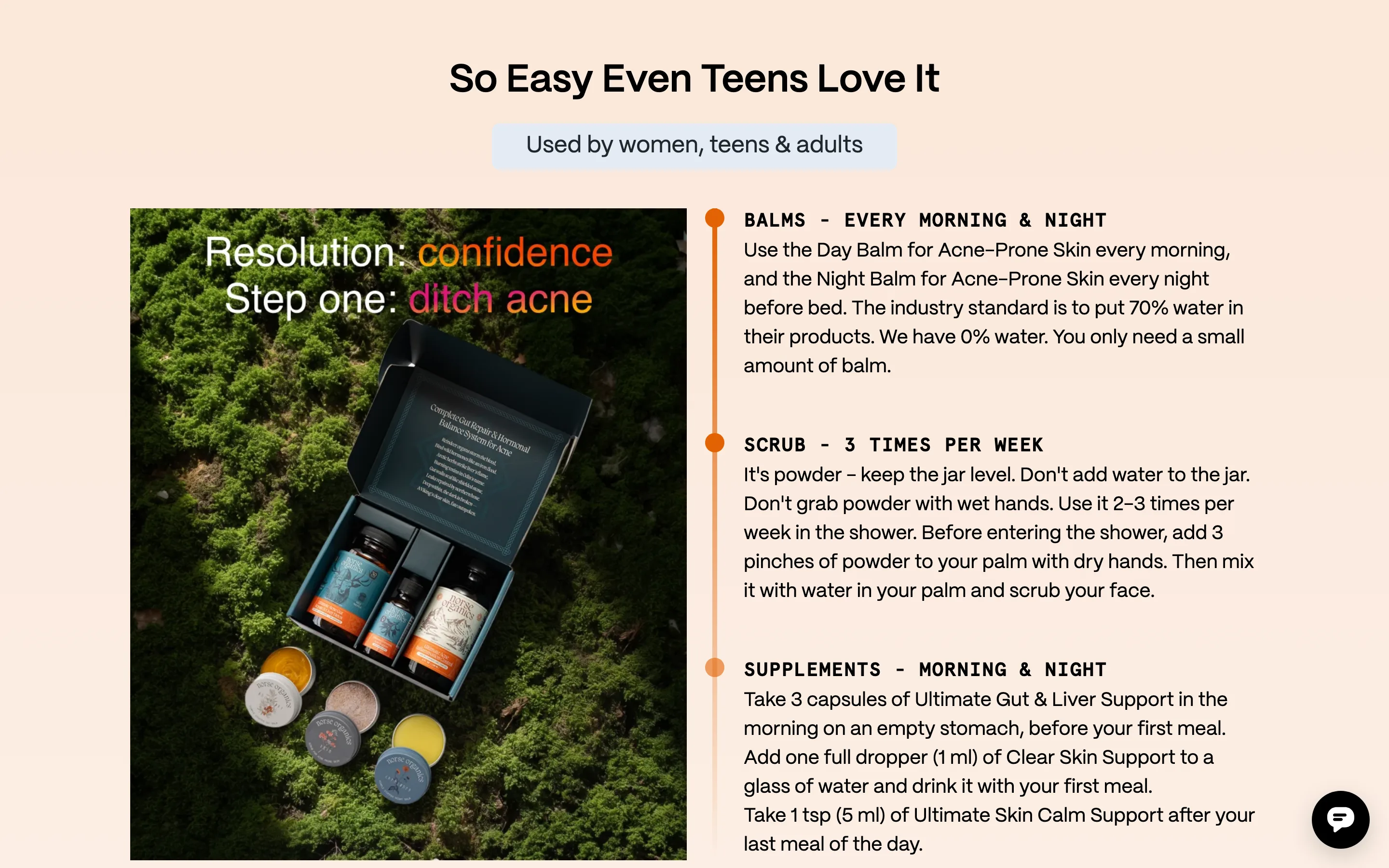
A rail with dots lists each step as a product name and when to use it (EVERY MORNING & NIGHT, 3 TIMES PER WEEK), then the literal instruction.
What it is
Under "So Easy Even Teens Love It", a product photo sits beside a vertical rail with three dots. Each step names the product and its frequency in caps (Balms, every morning and night; Scrub, 3 times per week; Supplements, morning and night), followed by the literal instruction of how to use it.
Why it works
For a multi-product routine the real objection is not "does it work" but "will I keep doing it". A timeline shows the whole commitment at a glance and makes it sound manageable, and putting the frequency in caps lets a skimmer understand the routine without reading the instructions.
How to test it
- Hypothesis
- Adding a routine timeline with each step's frequency will lift conversion on a multi-product routine by making the commitment feel manageable.
- Primary metric
- Conversion rate (landing page sessions)
- Guardrail metric
- Second-order retention rate
Related ideas
Want this tested on your store?
We run the experiment, call the result honestly, and get paid on what it adds.
See the performance program