Product pageDesktopFrictionClarity
Scroll a two-up image gallery under a sticky buy box
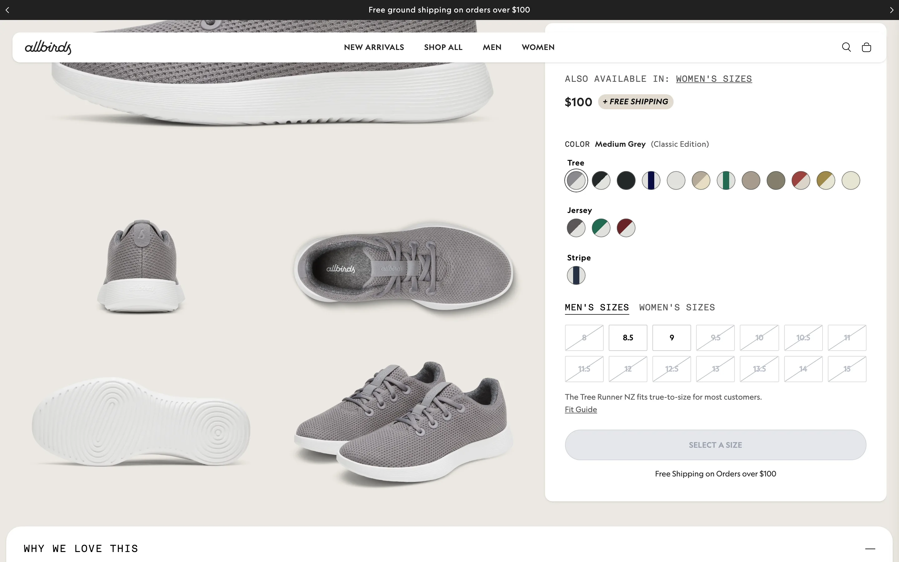
Product images run as a two-column grid that scrolls while the buy box (colours, sizes, fit note, CTA) stays pinned beside it.
What it is
Instead of a carousel, the product images run as a two-column grid that the shopper scrolls through, while the buy box (price, colour swatches, size grid, a fit note and the add button) stays pinned on the right.
Why it works
A carousel hides most images behind clicks that few people make. A scrolling grid shows every angle at a natural pace, and pinning the buy box means the shopper can act at the exact moment an image convinces them, without scrolling back up.
How to test it
- Hypothesis
- Replacing the gallery carousel with a scrolling two-up grid beside a sticky buy box will lift desktop add-to-cart rate.
- Primary metric
- Add-to-cart rate (desktop product page sessions)
- Guardrail metric
- Page load time, since the grid loads more images up front
Related ideas
Want this tested on your store?
We run the experiment, call the result honestly, and get paid on what it adds.
See the performance program