Landing pageDesktopFrictionUrgency
A coming-soon page with one field and one button
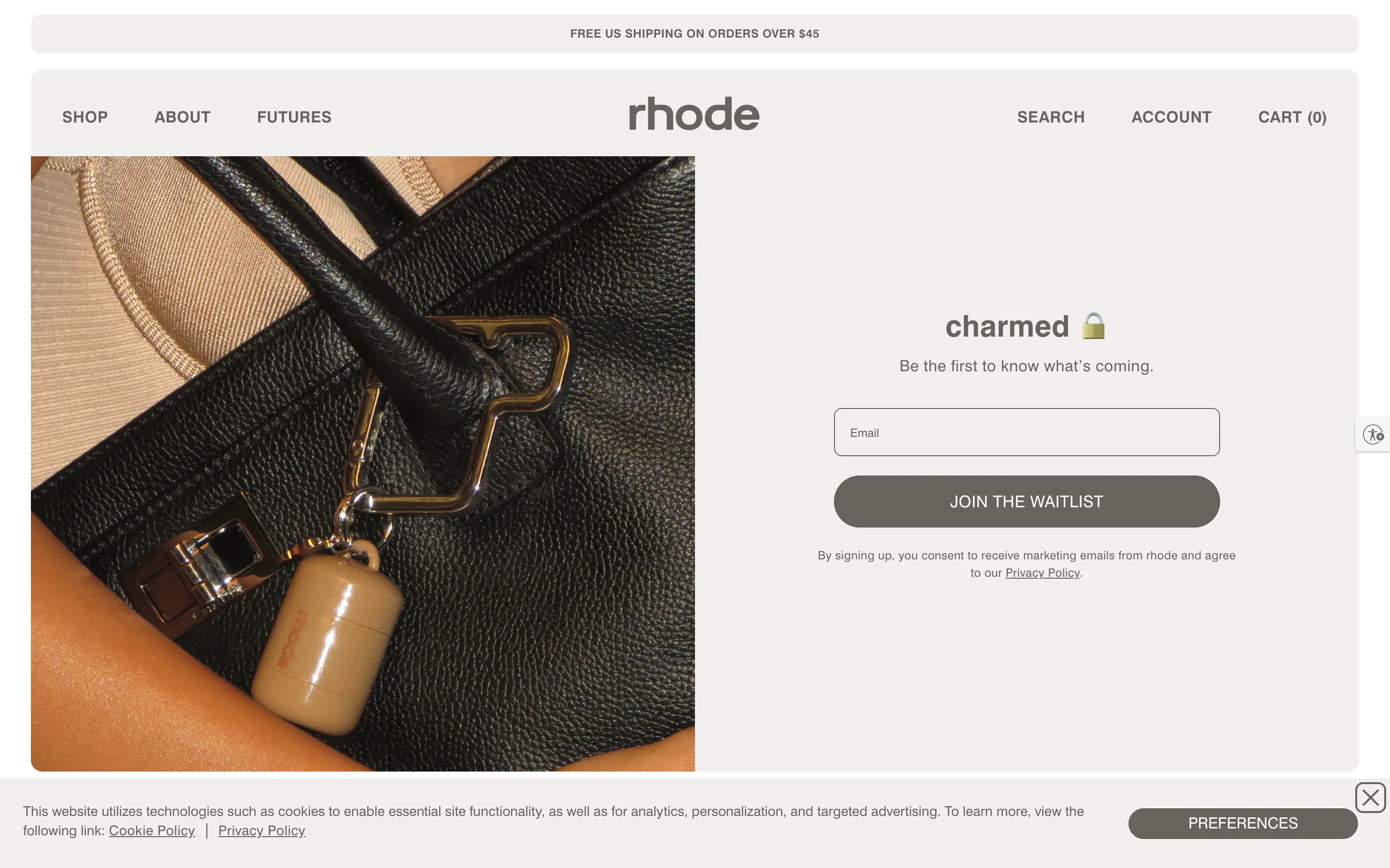
One word for a headline, one line, one email field and a full-width pill, beside a product macro. Nothing else, so the only action is joining.
What it is
The waitlist page is a split: a close-up product photo on the left, and on the right a one-word headline with a lock emoji, "Be the first to know what's coming", one outlined email field, a full-width "Join the waitlist" pill and a consent line. There is no other content on the page.
Why it works
A launch waitlist has one job, so every other element is a leak. The single word and the lock make it feel like an invitation to something not yet public, and the page is short enough that the button is in view on any screen.
How to test it
- Hypothesis
- Reducing a launch page to a single email field and button will lift waitlist signup rate versus a content-heavy pre-launch page.
- Primary metric
- Waitlist signup rate
- Guardrail metric
- Launch-day conversion rate of waitlist signups
Related ideas
Want this tested on your store?
We run the experiment, call the result honestly, and get paid on what it adds.
See the performance program